
The Flutter DropdownButton Tutorial for Beginners

This article was originally published on the Waldo blog.
Introduction
When crafting a user experience for your mobile app, you often need the user to select one item from a list of options. This could be for a variety of reasons, such as collecting information on a form, customizing settings, or for navigation.
In the case of a form, allowing users to select from a list of options when completing the form can make the user experience much smoother, while at the same time, ensuring the capture of only valid data. For instance, a country selection on an address form ensures that you always capture a valid country name.
As another example, consider the use case on a settings page. When choosing a WiFi network, it is common to allow the user to select from a list of available networks.
Flutter provides the DropdownButton widget to enable these types of user experiences. In this tutorial, we shall
- explore the visual components of a DropdownButton,
- learn how to create and customize this widget
- build a demo app to apply what we’ve learned
Flutter DropdownButton Visual Components
Visually, a DropdownButton comprises five overall components: selected item, icon, underline, dropdown, and items. See the diagram below for a visual representation of these components.
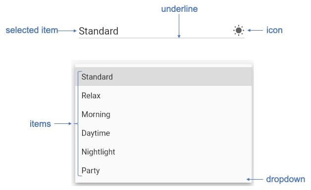
The selecteditem widget shows the selected item of the DropdownButton.
The icon widget shows a simple graphic on the right hand side of a button, usually as a downward facing arrow, to indicate that the button can be expanded to reveal additional options.
The underline widget displays a line underneath the DropdownButton. By default, all DropdownButtons have an underline. You can use this property to set a widget to customize the underline or you can assign an empty Container widget to this property if you don’t want an underline at all.
The dropdown widget shows the full list of available items. You can customize the DropdownButton to have a specific background color and shadow underneath the dropdown.
The items property lists the options available to select. The type for this property is a list of DropdownMenuItem<T>. Note that if this property is set to null then the entire DropdownButton becomes disabled.
DropdownButton Properties
In the previous section, we discussed the visual components of a DropdownButton. Icon, items and underline discussed in the previous section are properties that you set when creating a DropdownButton. Below are additional properties that you should be familiar with at a minimum.
- value is the currently selected item from the list of options.
- onChanged is a function that executes on selection of a new item. This function triggers a rebuild of the widget, usually by calling setState(). Note that if you set this property to null, then the entire DropdownButton becomes disabled.
- dropdownColor defines the color of the dropdown panel that displays the full list of items.
- elevation is an integer value that defines how high above the canvas the dropdown floats.
- style defines the style (font, color, etc.) to use for the text in the DropdownButton and items list.
- isExpanded is a boolean property; if true then the DropdownButton takes up the full width of its parent widget.
For a complete list of DropdownButton properties, you can review the details on flutter.dev. In the next section, we’ll learn how to define a basic DropdownButton.
Building a DropdownButton
Let’s take a look at the code needed to construct a simple DropdownButton. The code below shows how to create a basic DropdownButton that allows users to select a color: either red, green, or blue.
String? dropdownValue;
  @override
  Widget build(BuildContext context) {
    return DropdownButton<String>(
      value: dropdownValue,
      hint: Text('Select a color'),
      icon: const Icon(Icons.arrow_drop_down),
      onChanged: (String? newValue) {
        setState(() {
          dropdownValue = newValue!;
        });
      },
      items: <String>['Red', 'Green', 'Blue']
          .map<DropdownMenuItem<String>>((String value) {
        return DropdownMenuItem<String>(
          value: value,
          child: Text(value),
        );
      }).toList(),
    );
  }
Note that a DropdownButton is always defined with a type. In the example above, the type is String. The general form is DropdownButton<T> , where T is the type. Whatever type we specify when defining the DropdownButton also serves to define the type for its properties, such as the value property.
Demo App
Let’s now create an app to apply what we have learned. We’ll add a new feature to the demo app that we’ve been progressively improving over the course of my previous posts—the user interface for a smart home lighting app.
In the previous tutorial, How Do I Customize a Flutter AppBar? A Detailed Overview, we used custom Flutter AppBars to improve the user experience of configuring the light bulb settings. In this tutorial, we’ll add a DropdownButton to enable users to save lighting settings for different “scenes,” such as daytime or nighttime scenes.
This demo app does not depend on any third party libraries. Therefore, you can use DartPad to follow along. DartPad is a web-based editor where you can try out Flutter code without the need to install anything on your computer. To follow along with this tutorial, head over to https://dartpad.dev/
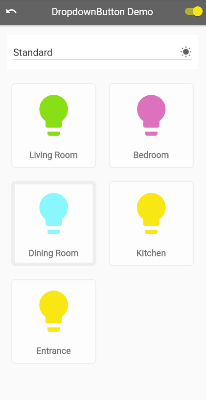
Below is what the final app will look like.
Step 1: Create the App Shell
First, let’s create a basic framework for the app. The code below creates a minimal app with one screen. It will have an AppBar at the top with the title “DropdownButton Demo,” and a text widget in the center of the screen with the words “Flutter DropdownButton Demo.” Paste this code into your editor and run the app to make sure that it loads as expected.
import 'package:flutter/material.dart';
void main() {
  runApp(MyApp());
}
class MyApp extends StatelessWidget {
  @override
  Widget build(BuildContext context) {
    return MaterialApp(
      theme: ThemeData.light(),
      debugShowCheckedModeBanner: false,
      home: MyHomePage(title: 'DropdownButton Demo'),
    );
  }
}
class MyHomePage extends StatefulWidget {
  final String title;
  MyHomePage({this.title = 'Demo'});
  @override
  _MyHomePageState createState() => _MyHomePageState();
}
class _MyHomePageState extends State<MyHomePage> {
  @override
  Widget build(BuildContext context) {
    return Scaffold(
        appBar: _buildMainAppBar(),
        body: Center(child: Text('Flutter DropdownButton Demo')));
  }
  AppBar _buildMainAppBar() {
    return AppBar(
      backgroundColor: Colors.black45,
      title: Text(widget.title),
    );
  }
}
Step 2: Define Custom Widgets and Classes
Next, we add custom widgets and classes. This app makes use of custom widget classes ColorSlider and LightBulbCard. Furthermore, we define the class LightBulbState to hold the configuration of a single light bulb. For this tutorial, it’s not important to know the details of these classes; you can paste this code directly into the bottom of your code editor. We’ll reference these classes in later steps. If you’d like to dive deeper into these, you can learn more in my tutorial Flutter Hexcolor: Using Hexadecimal Color Strings in Flutter.
class ColorSlider extends StatelessWidget {
  const ColorSlider({
    Key? key,
    required this.colorTitle,
    required this.colorValue,
    required this.onColorValueChange,
  }) : super(key: key);
  final String colorTitle;
  final int? colorValue;
  final Function(double) onColorValueChange;
  @override
  Widget build(BuildContext context) {
    return Padding(
      padding: const EdgeInsets.fromLTRB(16.0, 0, 12.0, 0),
      child: Row(
        children: [
          Expanded(
            child: Text(colorTitle),
            flex: 1,
          ),
          Expanded(
            child: Slider(
              activeColor: Colors.grey,
              inactiveColor: Colors.black12,
              value: colorValue!.toDouble(),
              min: 0,
              max: 255,
              label: colorValue!.round().toString(),
              onChanged: onColorValueChange,
            ),
            flex: 6,
          ),
          Expanded(
            child: Text(colorValue.toString()),
            flex: 1,
          )
        ],
      ),
    );
  }
}
class LightBulbCard extends StatelessWidget {
  const LightBulbCard(
      {this.room = 'Room Name', this.bulbState, this.selected = false});
  final String room;
  final LightBulbState? bulbState;
  final bool selected;
  @override
  Widget build(BuildContext context) {
    return Container(
      decoration: BoxDecoration(
        border:
            Border.all(color: Color(0xffeeeeee), width: selected ? 7.0 : 2.0),
        color: Colors.white38,
        borderRadius: BorderRadius.all(Radius.circular(8.0)),
        boxShadow: [
          BoxShadow(
            color: Colors.white10,
            blurRadius: 4,
            spreadRadius: 2,
            offset: Offset(0, 2),
          ),
        ],
      ),
      margin: EdgeInsets.all(8),
      height: 200,
      width: 200,
      child: Column(
        mainAxisAlignment: MainAxisAlignment.center,
        children: [
          Center(
              child: Icon(
            Icons.lightbulb,
            size: 100.0,
            color:
                bulbState!.on ? Color(bulbState!.hexIntValue()) : Colors.grey,
          )),
          SizedBox(
            height: 20.0,
          ),
          Text(
            room,
            style: TextStyle(
                fontWeight: FontWeight.bold,
                fontSize: 18.0,
                color: Colors.black54),
          ),
        ],
      ),
    );
  }
}
class LightBulbState {
  bool on;
  int redValue;
  int greenValue;
  int blueValue;
  int alphaValue;
  LightBulbState(
      {this.on = true,
      this.redValue = 255,
      this.greenValue = 255,
      this.blueValue = 0,
      this.alphaValue = 255});
  String hexString() =>
      '${alphaValue.toRadixString(16).padLeft(2, '0')}' +
      '${redValue.toRadixString(16).padLeft(2, '0')}' +
      '${greenValue.toRadixString(16).padLeft(2, '0')}' +
      '${blueValue.toRadixString(16).padLeft(2, '0')}';
  int hexIntValue() {
    return int.parse(hexString(), radix: 16);
  }
}
Step 3: Add State Variables
Let’s now create the variables that represent the state of the app at any point in time. The selectedRoom variable stores the name of the room selected by the user for adjusting the color settings. The lightSwitchNames variable lists all the rooms with smart lights that our app can control. The lightScenes variable lists the scenes, or configurations, that we can program for the lights. With the lightSwitches variable, we build a data structure that allows us to adjust the individual lights for all our light scenes. The masterSwitchOn variable controls a switch in the AppBar used to turn all the lights on or off at once. Finally, selectedScene is the currently selected scene in our new DropdownButton.
class _MyHomePageState extends State<MyHomePage> {
  String? selectedRoom;
  var lightSwitchNames = [
    'Living Room',
    'Bedroom',
    'Dining Room',
    'Kitchen',
    'Entrance'
  ];
  var lightScenes = [
    'Standard',
    'Relax',
    'Morning',
    'Daytime',
    'Nightlight',
    'Party'
  ];
  late Map<String, Map<String, LightBulbState>> lightSwitches =
      Map.fromIterable(lightScenes,
          key: (lightScene) => lightScene,
          value: (lightScene) => Map.fromIterable(lightSwitchNames,
              key: (lightSwitchName) => lightSwitchName,
              value: (lightSwitchName) => LightBulbState()));
  var masterSwitchOn = true;
  late String selectedScene = lightScenes.first;
Step 4: Add the Widget Builder Functions
Next, we construct the core widgets used throughout the app. In prior tutorials, we discussed the widgets that we used to create the base version of the app that we’re improving in this tutorial. Go ahead and paste this set of functions into the _MyHomePageState class. Make sure to replace the _buildMainAppBar() function from Step 1. In Step 6, we’ll add the DropdownButton for controlling the lighting scenes.
AppBar _buildMainAppBar() {
    return AppBar(
        backgroundColor: Colors.black45,
        title: Text(widget.title),
        leading: GestureDetector(
          child: Center(child: Icon(Icons.undo)),
          onTap: () {
            setState(() {
              lightSwitchNames.forEach((roomName) {
                lightSwitches[selectedScene]?[roomName] = LightBulbState();
              });
              masterSwitchOn = false;
              lightSwitches[selectedScene]?.forEach((roomName, bulbState) {
                if (bulbState.on) {
                  masterSwitchOn = true;
                }
              });
            });
          },
        ),
        actions: [
          Switch(
            value: masterSwitchOn,
            activeColor: Colors.yellowAccent,
            onChanged: (bool switchState) {
              setState(() {
                masterSwitchOn = switchState;
                lightSwitches[selectedScene]?.forEach((room, lightBulbState) =>
                    lightBulbState.on = masterSwitchOn);
              });
            },
          ),
        ]);
  }
  Future _showLightControlPanel(BuildContext context, String roomName) {
    return showModalBottomSheet(
      isScrollControlled: true,
      context: context,
      builder: (builder) {
        return StatefulBuilder(builder: (BuildContext context, setState) {
          return Container(
              height: MediaQuery.of(context).size.height / 2.4,
              child: new Scaffold(
                appBar: _buildLightControlPanelAppBar(roomName, setState),
                body: _buildLightControlPanelBody(setState),
              ));
        });
      },
    );
  }
  AppBar _buildLightControlPanelAppBar(String roomName, StateSetter setState) {
    return AppBar(
      bottom: PreferredSize(
        child: Container(
            color: Color(
                lightSwitches[selectedScene]![selectedRoom]!.hexIntValue()),
            height: 4.0),
        preferredSize: Size.fromHeight(4.0),
      ),
      title: Text(roomName),
      elevation: 0.0,
      backgroundColor: Color(0xFF777777),
      leading: Center(
          child: Icon(
        Icons.lightbulb,
        color:
            Color(lightSwitches[selectedScene]![selectedRoom]!.hexIntValue()),
      )),
      actions: [
        Container(
          alignment: Alignment.center,
          padding: EdgeInsets.only(right: 16.0),
          child: Switch(
            activeColor: Color(
                lightSwitches[selectedScene]![selectedRoom]!.hexIntValue()),
            value: lightSwitches[selectedScene]![selectedRoom]!.on,
            onChanged: (bool? value) {
              setState(() {
                this.setState(() {
                  lightSwitches[selectedScene]?[selectedRoom]?.on = value!;
                  masterSwitchOn = false;
                  lightSwitches[selectedScene]?.forEach((key, value) {
                    if (value.on) {
                      masterSwitchOn = true;
                    }
                  });
                });
              });
            },
          ),
        ),
      ],
    );
  }
  Column _buildLightControlPanelBody(StateSetter setState) {
    return Column(
      children: [
        SizedBox(
          height: 10.0,
        ),
        ColorSlider(
            colorTitle: 'Red',
            colorValue: lightSwitches[selectedScene]?[selectedRoom]!.redValue,
            onColorValueChange: (double value) {
              setState(() {
                this.setState(() {
                  lightSwitches[selectedScene]?[selectedRoom]!.redValue =
                      value.round();
                });
              });
            }),
        ColorSlider(
            colorTitle: 'Green',
            colorValue: lightSwitches[selectedScene]?[selectedRoom]!.greenValue,
            onColorValueChange: (double value) {
              setState(() {
                this.setState(() {
                  lightSwitches[selectedScene]?[selectedRoom]!.greenValue =
                      value.round();
                });
              });
            }),
        ColorSlider(
            colorTitle: 'Blue',
            colorValue: lightSwitches[selectedScene]?[selectedRoom]!.blueValue,
            onColorValueChange: (double value) {
              setState(() {
                this.setState(() {
                  lightSwitches[selectedScene]?[selectedRoom]!.blueValue =
                      value.round();
                });
              });
            }),
        ColorSlider(
            colorTitle: 'Alpha',
            colorValue: lightSwitches[selectedScene]?[selectedRoom]!.alphaValue,
            onColorValueChange: (double value) {
              setState(() {
                this.setState(() {
                  lightSwitches[selectedScene]?[selectedRoom]!.alphaValue =
                      value.round();
                });
              });
            }),
      ],
    );
  }
Step 5: Add the Light Bulbs
Next, we display the icons of light bulbs in a GridView. Paste the code below into the _MyHomePageState build function. You can now run the app and adjust the lights for each room. We don’t yet have the ability to switch between different light scenes, but we have all the infrastructure in place. Later, in Step 6, we’ll enable this new feature by adding the DropdownButton to the app to control switching between different scenes.
@override
  Widget build(BuildContext context) {
    return Scaffold(
        appBar: _buildMainAppBar(),
        body: Column(
          children: [
            Expanded(
              child: GridView.count(
                primary: false,
                padding: const EdgeInsets.all(20),
                crossAxisSpacing: 10,
                mainAxisSpacing: 10,
                crossAxisCount: 2,
                children: lightSwitchNames
                    .map((roomName) => GestureDetector(
                        child: LightBulbCard(
                          room: roomName,
                          bulbState: lightSwitches[selectedScene]?[roomName],
                          selected: roomName == selectedRoom,
                        ),
                        onTap: () {
                          setState(() {
                            selectedRoom = roomName;
                          });
                          _showLightControlPanel(context, roomName);
                        }))
                    .toList(),
              ),
            ),
          ],
        ));
  }
Step 6: Add the DropdownButton for Controlling the Light Scenes
Finally, let’s add the DropdownButton right above our GridView. Below, you’ll notice that we wrapped our DropdownButton with a container. This was done for formatting purposes to improve the layout.
@override
  Widget build(BuildContext context) {
    return Scaffold(
        appBar: _buildMainAppBar(),
        body: Column(
          children: [
            Container(
              margin: EdgeInsets.only(top: 20.0, left: 20, right: 20.0),
              padding: EdgeInsets.all(12.0),
              height: 70.0,
              color: Colors.white,
              child: DropdownButton<String>(
                value: selectedScene,
                icon: const Icon(Icons.wb_sunny),
                iconSize: 24,
                style: const TextStyle(color: Colors.black87, fontSize: 20.0),
                onChanged: (String? newValue) {
                  setState(() {
                    selectedScene = newValue!;
                    masterSwitchOn = false;
                    lightSwitches[selectedScene]?.forEach((key, value) {
                      if (value.on) {
                        masterSwitchOn = true;
                      }
                    });
                  });
                },
                isExpanded: true,
                items:
                    lightScenes.map<DropdownMenuItem<String>>((String value) {
                  return DropdownMenuItem<String>(
                    value: value,
                    child: Text(value),
                  );
                }).toList(),
              ),
            ),
            Expanded(
              child: GridView.count(
...
Step 7: Test the Complete App
You should now have a fully working app. Try to create different lighting settings for each scene, and test that the lights change as expected when switching from one scene to the next. If you get stuck, you can refer to the full code listing here: https://dartpad.dev/?id=b2074ca1a0de4f509257fcae65594883&null_safety=true
Conclusion
In this tutorial, we learned how to define and integrate DropdownButton widgets into a Flutter app. We applied what we learned in the latest iteration of our smart home lighting app, which now includes a DropdownButton to switch between different lighting scenes. You’ve now expanded your knowledge of Flutter to help you improve the user experience of your apps.
If you want to learn more, a lot of useful content can be found on Waldo. There, you’ll find content on mobile design, mobile engineering, QA & testing, and more.
