
How to Implement Flutter Material Dialogs in Your App

This article was originally published on the Waldo blog.
Introduction
There are certain points in your app’s user journey that require the user to provide input before proceeding. When this occurs, a pop-up window appears for the user to interact with to provide their input. The rest of the user interface is disabled at this point and the user must take some action based on the options presented. The name that we give to these types of pop-up windows is a dialog.
Dialogs are found in all types of graphical user interfaces. A common example you have likely encountered is the “Open File” dialog, for example, in your web browser. As soon as it appears, all other functions are disabled and you must either select a file or cancel to go back.
In mobile apps, we have dialogs for situations such as confirmation of a yes/no decision, selection of one item from a list, and even completion of an entire form.
The Flutter framework provides a set of classes and functions that enable you to create these user interaction flows in your apps. In this article, you’ll learn about the Flutter dialog that follow the Material Design System principles; therefore, we’ll refer to these dialogs as Material dialogs.
In this article, we will cover the below topics:
- Practical use cases for dialogs
- Different types of Material dialogs
- How to define Flutter Material dialogs in Flutter
- How to display Flutter Material dialogs
Practical Use Cases for Dialogs
One use case is the need to capture a yes/no decision from the user. For example, a system may need to confirm the user’s intention to delete a record. Before deleting the record, the system could display a floating window with the text “Delete record 123?” and two buttons underneath, “Confirm” and “Cancel.” Inserting a step like this into user flows gives the user an opportunity to confirm actions that are hard to undo, such as deleting a record in this example.
Another example is selection of an item from a list. This could be useful in an email app that allows users to set up multiple profiles. In such an app, only one profile can be active at a time. When the user requests to switch profiles, a list of all the configured profiles can appear in a dialog for the user to select from. After they select the new profile, the app immediately switches over to that profile.
In other scenarios, a user must fill in a detailed form before proceeding. For example a user may want to schedule a meeting in a calendar app. Attempting to schedule a meeting could trigger the display of a pop-up window to collect all the event details. If the user changes their mind, they can cancel and go back like nothing happened. If they do choose to schedule the event, once they enter and submit all the details, the dialog disappears. The app takes the user back to the calendar view, now updated with the new calendar event details.
Types of Material Dialogs
In general, there are four types of Material dialogs. These are Alert, Simple, Confirmation, and Full Screen. Each type is well suited to support a particular category of use cases. In this section, we shall explore these types of dialogs and learn what features Flutter provides to help us implement them.
Alert Dialog
An alert dialog is used to confirm or cancel simple decisions before the system goes ahead with the action, such as deleting an email or resetting a device to factory defaults. Alert dialogs interrupt the general flow of the app, therefore it’s best to keep the wording and choices easy to understand. Below is an example of how one might look.
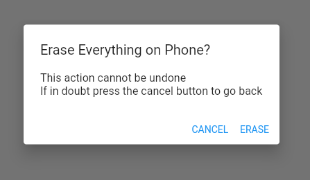
To implement an alert dialog in Flutter, you can use the AlertDialog widget class. The AlertDialog class makes it easy to create a dialog like the one in the image above. It provides properties for the title, content, and actions. The title property is the widget that displays at the top of the dialog, the content displays directly beneath the title, and the actions are a list of widgets for buttons at the bottom.
Here’s an example of how to define the AlertDialog from the image above.
AlertDialog(
      title: const Text('Erase Everything on Phone?'),
      content: SingleChildScrollView(
        child: ListBody(
          children: const <Widget>[
            Text('This action cannot be undone'),
            Text('If in doubt press the cancel button to go back'),
          ],
        ),
      ),
      actions: <Widget>[
        TextButton(
          child: const Text('CANCEL'),
          onPressed: () {
            Navigator.of(context).pop();
          },
        ),
        TextButton(
          child: const Text('ERASE'),
          onPressed: () {
            Navigator.of(context).pop();
          },
        ),
      ],
    )
By setting properties on an AlertDialog, you can customize the look and feel quite a bit. For example, you can change the background color, shape and elevation of the AlertDialogcontainer.
Simple Dialog
A simple dialog is used to display lists of options for the user to select from. When the user selects an option, the app completes the action and the dialog is dismissed. No other button to confirm their choice is needed.
For example, this could be used to select the WiFi network a user wants to use. See below for a screenshot of what this might look like.
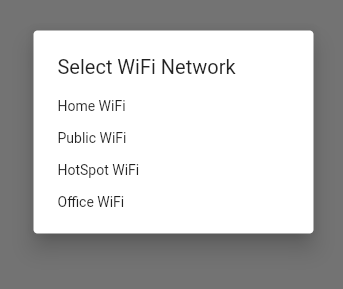
To implement a simple dialog in Flutter, you can use the SimpleDialog widget class. Similar to the AlertDialog, the SimpleDialog provides properties to easily create a dialog that follows the Material Design system pattern. The SimpleDialog class has a title property, but does not have content or actions. Instead, SimpleDialog provides a property named children, which is a list of widgets containing the options presented to the user. Flutter provides a widget named SimpleDialogOption that can be used for each item in the list of children. See below for an example of how to define the SimpleDialog from the screenshot above.
SimpleDialog(
      title: const Text('Select WiFi Network'),
      children: <Widget>[
        SimpleDialogOption(
          onPressed: () {
            Navigator.pop(context, 'My Home WiFi');
          },
          child: const Text('Home WiFi'),
        ),
        SimpleDialogOption(
          onPressed: () {
            Navigator.pop(context, 'Public WiFi');
          },
          child: const Text('Public WiFi'),
        ),
        SimpleDialogOption(
          onPressed: () {
            Navigator.pop(context, 'HotSpot WiFi');
          },
          child: const Text('HotSpot WiFi'),
        ),
        SimpleDialogOption(
          onPressed: () {
            Navigator.pop(context, 'Office WiFi');
          },
          child: const Text('Office WiFi'),
        ),
      ],
    )
Confirmation Dialog
Confirmation dialogs works similar to a simple dialogs, the only difference is that before completing the action, the user is given the opportunity to confirm or cancel.
In the example of selecting a WiFi network from the previous section, we can adapt it to include a confirmation dialog as in the screenshot below.
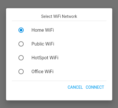
Flutter does not provide an out-of-the-box class for confirmation dialogs, but you can create your own by customizing the Flutter dialog class, as shown in the code snippet below.
Dialog(
    child: Container(
        height: 320,
        padding: const EdgeInsets.all(20.0),
        child: Column(children: <Widget>[
          const Text('Select WiFi Network'),
          const Divider(),
          RadioListTile<WiFi>(
            title: const Text('Home WiFi'),
            value: WiFi.home,
            groupValue: _wifi,
            onChanged: (WiFi? value) {
              setState(() {
                _wifi = value;
              });
            },
          ),
          RadioListTile<WiFi>(
            title: const Text('Public WiFi'),
            value: WiFi.public,
            groupValue: _wifi,
            onChanged: (WiFi? value) {
              setState(() {
                _wifi = value;
              });
            },
          ),
          RadioListTile<WiFi>(
            title: const Text('HotSpot WiFi'),
            value: WiFi.hotspot,
            groupValue: _wifi,
            onChanged: (WiFi? value) {
              setState(() {
                _wifi = value;
              });
            },
          ),
          RadioListTile<WiFi>(
            title: const Text('Office WiFi'),
            value: WiFi.office,
            groupValue: _wifi,
            onChanged: (WiFi? value) {
              setState(() {
                _wifi = value;
              });
            },
          ),
          const Divider(),
          Row(
            mainAxisAlignment: MainAxisAlignment.end,
            children: <Widget>[
              TextButton(
                child: const Text('CANCEL'),
                onPressed: () {
                  Navigator.of(context).pop();
                },
              ),
              const SizedBox(width: 8),
              TextButton(
                child: const Text('CONNECT'),
                onPressed: () {
                  Navigator.of(context).pop();
                },
              ),
              const SizedBox(width: 8),
            ],
          ),
        ])),
  )
Full-Screen Dialog
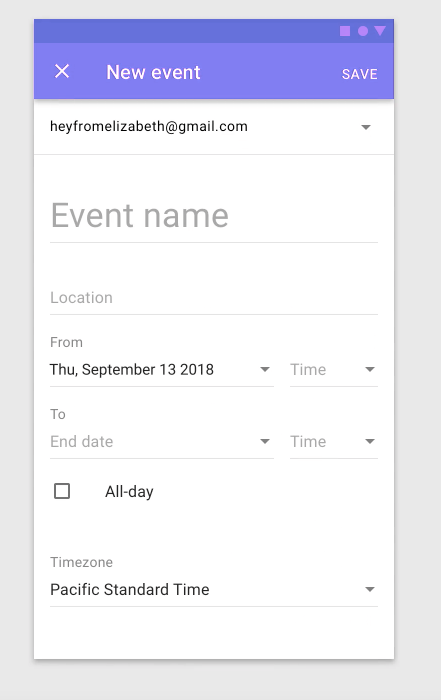
A full-screen dialog works similar to the other dialogs discussed already. The only difference is that this dialog takes over the entire screen so the user can complete a form with fields.
An example of this from material.io can be seen below, in which the app prompts a user to provide all the details needed to create a calendar event.
How to Show a Dialog in Your App
Now that you’ve learned how to define Material dialogs in Flutter, let’s discuss briefly how to actually make them appear. Flutter provides two built in functions to make this happen: showDialog and showGeneralDialog.
The function showDialog is the simpler of the two. It has two required parameters, called context and builder. To make your dialog appear, simply set a builder that returns the dialog. See the code snippet below for an example.
showDialog(
  context: context,
  builder: (context) {
    return AlertDialog(
        title: const Text('Erase Everything on Phone?'),
        content: SingleChildScrollView(
          child: ListBody(
            children: const <Widget>[
              Text('This action cannot be undone'),
              Text('If in doubt press the cancel button to go back'),
            ],
          ),
        ),
        actions: <Widget>[
          TextButton(
            child: const Text('CANCEL'),
            onPressed: () {
              Navigator.of(context).pop();
            },
          ),
          TextButton(
            child: const Text('ERASE'),
            onPressed: () {
              Navigator.of(context).pop();
            },
          ),
        ],
    );
  },
);
The function showGeneralDialog is more complex, and allows you to design more sophisticated dialogs. For example, you can customize the animations for the dialog, which is beyond the scope of this article. The showGeneralDialog function is also useful when you want to display a full screen dialog. You can learn more about this function at flutter.dev
Conclusion
In this article, you learned about how dialogs fit into the overall user flow of an app. We learned how important it is to carefully consider how and when to use dialogs, since they interrupt the user in order to provide critical information or request important input.
We saw that dialogs, as defined in the Material Design system, can be categorized into four main types: alert dialogs, simple dialogs, confirmation dialogs and full screen dialogs. Furthermore, we discovered that Flutter provides some built-in widgets to help us implement these in our apps. We discussed example use cases for each and also sample code snippets that you can use in your own app.
With this knowledge, you can now enhance the user flows for your own apps to ensure that critical user alerts and interactions are as smooth as possible.
The Waldo blog is an excellent resource for content on mobile design, development, and testing. There you will find many articles on Flutter and other technologies used to build apps. You can also learn more about Waldo's Flutter support here.
