
How Do I Customize a Flutter AppBar? A Detailed Overview

This article was originally published on the Waldo blog.
Introduction
AppBars are important components in an app. Since the screen real estate on mobile devices is limited, an AppBar plays an important role in helping users know where they are in the application. For example, just about every AppBar includes a title at the top that indicates what screen you’re viewing.
AppBars often provide an anchor from which to navigate to different screens, like a Back button to navigate to the previous screen. In some cases, an AppBar includes a button that opens up a side panel with more links for navigating to different screens in the app.
In addition to serving as a navigation point, AppBars can also include buttons that execute key actions on the main content of a screen, such as a Save button on a screen for editing a user’s profile information. AppBars can get very sophisticated, even including a text field to enable searching content by keyword.
Flutter provides many ways to customize AppBars for your needs. In this tutorial, we’ll
- discuss the components of a Flutter AppBar,
- learn how to configure the visual appearance of an AppBar
- demonstrate how to add custom widget elements within an AppBar
- build a demo app to apply what we’ve learned
AppBar Components
AppBars comprise five main components: leading, title, actions, flexibleSpace and bottom. In the image below from flutter.dev, you can gain a visual and intuitive understanding of these components.
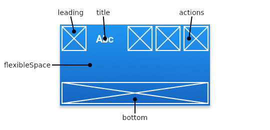
The leading component, which displays in the top left of the AppBar, is of type Widget. Therefore, you can place any widget there, such as Text or Icon. The leading component often displays an icon to navigate to the previous screen.
The title component, also of type Widget, displays in the top center of the AppBar. As the name suggests, this spot usually shows the title of the screen.
The actions component is of type Widget, or can contain a list of widgets. These are usually buttons to execute some operations. For example, if the main content was an email message, one action might be a button to send the message.
The flexibleSpace component sits behind the other components in the AppBar. It’s usually used with a special type of AppBar, called a SliverAppBar, that can expand and contract to show and hide the content in the flexibleSpace, which is often some type of image.
Finally, the bottom component attaches to the bottom edge of the AppBar. It can be any Widget and is often used to display a TabBar.
AppBar Properties
We can set up all of the components described above when constructing an AppBar, by setting properties when we create the AppBar. We can set many more properties on an AppBar. In this section, we’ll cover a few of the essential properties that you should know about.
- backgroundColor: This sets the overall background color of the AppBar.
- foregroundColor: This sets the color that text and icons take by default.
- elevation: An AppBar can float above its parent widget. The elevation is how far above it floats.
- shadowColor: If the AppBar has an elevation, this sets the color of the shadow below the AppBar.
Our Demo App
Let’s now create an app to apply what we’ve learned. We’ll build on the concept of a smart home lighting app, discussed in my previous posts Flutter Checkbox Tutorial: How to Create and Use a Checkbox and Flutter Hexcolor: Using Hexadecimal Color Strings in Flutter.
In those tutorials, we built an app that lets you turn on or off lights in your house and adjust the color for each light. In this tutorial, we’ll make use of Flutter AppBar features to improve the user experience.
This demo app does not depend on any third party libraries; therefore, you can use DartPad to follow along. DartPad is a web based editor where you can try out Flutter code without the need to install anything on your computer. To follow along in this tutorial head over to https://dartpad.dev/.
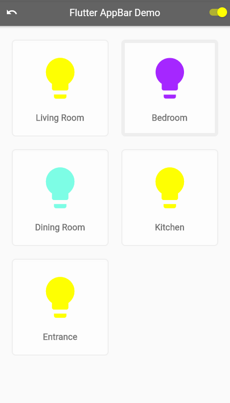
This is what the final app will look like.
Step 1: Create the App Shell
In the first step, we’ll get the basic shell of the app in place. This gives us a stable point to start from. The code is relatively short and easily understandable. Go ahead and paste the code below into your code editor and run the app. You should see a screen with a dark grey AppBar at the top, and text “Flutter AppBar Demo” in the center. Note how we use the backgroundColor property to set the AppBar color.
import 'package:flutter/material.dart';
void main() {
  runApp(MyApp());
}
class MyApp extends StatelessWidget {
  @override
  Widget build(BuildContext context) {
    return MaterialApp(
      theme: ThemeData.light(),
      debugShowCheckedModeBanner: false,
      home: MyHomePage(title: 'Flutter AppBar Demo'),
    );
  }
}
class MyHomePage extends StatefulWidget {
  final String title;
  MyHomePage({this.title = 'Demo'});
  @override
  _MyHomePageState createState() => _MyHomePageState();
}
class _MyHomePageState extends State<MyHomePage> {
  @override
  Widget build(BuildContext context) {
    return Scaffold(
        appBar: _buildMainAppBar(),
        body: Center(child: Text('Flutter AppBar Demo')));
  }
  AppBar _buildMainAppBar() {
    return AppBar(
      backgroundColor: Colors.black45,
      title: Text(widget.title),
    );
  }
}
Step 2: Define Custom Widgets and Classes
This app makes use of the custom widget classes ColorSlider and LightBulbCard. Furthermore, we define the class LightBulbState to hold the configuration of a single light bulb. For this tutorial, it’s not important to know the details of these classes. Therefore, you can paste this code directly into the bottom of the editor. We’ll reference these classes in later steps. If you would like to dive deeper into those classes, you can learn more in my previous tutorial Flutter Hexcolor: Using Hexadecimal Color Strings in Flutter.
class ColorSlider extends StatelessWidget {
  const ColorSlider({
    Key? key,
    required this.colorTitle,
    required this.colorValue,
    required this.onColorValueChange,
  }) : super(key: key);
  final String colorTitle;
  final int? colorValue;
  final Function(double) onColorValueChange;
  @override
  Widget build(BuildContext context) {
    return Padding(
      padding: const EdgeInsets.fromLTRB(16.0, 0, 12.0, 0),
      child: Row(
        children: [
          Expanded(
            child: Text(colorTitle),
            flex: 1,
          ),
          Expanded(
            child: Slider(
              activeColor: Colors.grey,
              inactiveColor: Colors.black12,
              value: colorValue!.toDouble(),
              min: 0,
              max: 255,
              label: colorValue!.round().toString(),
              onChanged: onColorValueChange,
            ),
            flex: 6,
          ),
          Expanded(
            child: Text(colorValue.toString()),
            flex: 1,
          )
        ],
      ),
    );
  }
}
class LightBulbCard extends StatelessWidget {
  const LightBulbCard(
      {this.room = 'Room Name', this.bulbState, this.selected = false});
  final String room;
  final LightBulbState? bulbState;
  final bool selected;
  @override
  Widget build(BuildContext context) {
    return Container(
      decoration: BoxDecoration(
        border:
            Border.all(color: Color(0xffeeeeee), width: selected ? 7.0 : 2.0),
        color: Colors.white38,
        borderRadius: BorderRadius.all(Radius.circular(8.0)),
        boxShadow: [
          BoxShadow(
            color: Colors.white10,
            blurRadius: 4,
            spreadRadius: 2,
            offset: Offset(0, 2),
          ),
        ],
      ),
      margin: EdgeInsets.all(8),
      height: 200,
      width: 200,
      child: Column(
        mainAxisAlignment: MainAxisAlignment.center,
        children: [
          Center(
              child: Icon(
            Icons.lightbulb,
            size: 100.0,
            color:
                bulbState!.on ? Color(bulbState!.hexIntValue()) : Colors.grey,
          )),
          SizedBox(
            height: 20.0,
          ),
          Text(
            room,
            style: TextStyle(
                fontWeight: FontWeight.bold,
                fontSize: 18.0,
                color: Colors.black54),
          ),
        ],
      ),
    );
  }
}
class LightBulbState {
  bool on;
  int redValue;
  int greenValue;
  int blueValue;
  int alphaValue;
  LightBulbState(
      {this.on = true,
      this.redValue = 255,
      this.greenValue = 255,
      this.blueValue = 0,
      this.alphaValue = 255});
  String hexString() =>
      '${alphaValue.toRadixString(16).padLeft(2, '0')}' +
      '${redValue.toRadixString(16).padLeft(2, '0')}' +
      '${greenValue.toRadixString(16).padLeft(2, '0')}' +
      '${blueValue.toRadixString(16).padLeft(2, '0')}';
  int hexIntValue() {
    return int.parse(hexString(), radix: 16);
  }
}
Step 3: Add State Variables
In Step 3, we set up the state variables forming the heart of the application. You’ll notice that we reference the LightBulbState class that we defined in Step 2. The variable selectedRoom identifies the currently selected light bulb. The lightSwitches variable holds the names of all rooms, as well as each room’s current configuration. The masterSwitchOn variable will control the switch that we’ll include in the main AppBar to turn all the light bulbs on and off.
Paste the variables below, along with the initState function at the top of the _MyHomePageState class.
class _MyHomePageState extends State<MyHomePage> {
  String? selectedRoom;
  Map<String, LightBulbState> lightSwitches = {
    'Living Room': LightBulbState(),
    'Bedroom': LightBulbState(),
    'Dining Room': LightBulbState(),
    'Kitchen': LightBulbState(),
    'Entrance': LightBulbState(),
  };
  var masterSwitchOn = true;
  @override
  void initState() {
    selectedRoom = lightSwitches.keys.first;
    super.initState();
  }
...
Step 4: Configure the Main AppBar
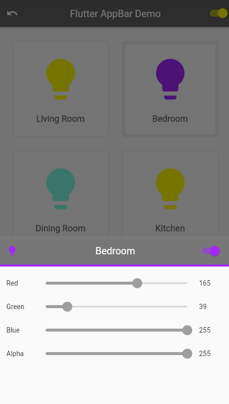
We’ll now get into configuring our AppBars. You’ll notice from the screenshot of the final app that we have two AppBars. The first displays at the top of the main screen. A second AppBar displays on the bottom sheet, which we’ll define in a later step.
Notice in the code below that we add a leading widget, which is an undo icon. When a user presses this widget, it resets the light bulbs back to their initial states. We also include a switch as an action. When a user sets this switch from off to on, it turns on all the lights. When set from on to off, it turns off all the lights.
AppBar _buildMainAppBar() {
    return AppBar(
        backgroundColor: Colors.black45,
        title: Text(widget.title),
        leading: GestureDetector(
          child: Center(child: Icon(Icons.undo)),
          onTap: () {
            setState(() {
              lightSwitches.forEach((roomName, bulbState) {
                lightSwitches[roomName] = LightBulbState();
              });
              masterSwitchOn = false;
              lightSwitches.forEach((roomName, bulbState) {
                if (bulbState.on) {
                  masterSwitchOn = true;
                }
              });
            });
          },
        ),
        actions: [
          Switch(
            value: masterSwitchOn,
            activeColor: Colors.yellowAccent,
            onChanged: (bool switchState) {
              setState(() {
                masterSwitchOn = switchState;
                lightSwitches.forEach((room, lightBulbState) =>
                    lightBulbState.on = masterSwitchOn);
              });
            },
          ),
        ]);
  }
Step 5: Show Light Bulbs on Main App Screen
We are now ready to display all the light bulbs on the main screen. In the code below, we use a GridView to display a LightBulbCard for each light bulb that we defined in Step 3. Note that we have commented out the function call _showLightControlPanel(context, roomName). This enables a bottom sheet to display for configuring the selected bulb, but we must first complete Step 6 before we can enable this.
Replace the build function of _MyHomePageState with the code below. When you run the app now, you’ll see all the lights turn on and off when you adjust the master switch in the main AppBar.
@override
  Widget build(BuildContext context) {
    return Scaffold(
        appBar: _buildMainAppBar(),
        body: GridView.count(
          primary: false,
          padding: const EdgeInsets.all(20),
          crossAxisSpacing: 10,
          mainAxisSpacing: 10,
          crossAxisCount: 2,
          children: lightSwitches.keys
              .map((roomName) => GestureDetector(
                  child: LightBulbCard(
                    room: roomName,
                    bulbState: lightSwitches[roomName],
                    selected: roomName == selectedRoom,
                  ),
                  onTap: () {
                    setState(() {
                      selectedRoom = roomName;
                    });
                    // _showLightControlPanel(context, roomName);
                  }))
              .toList(),
        ));
}
Step 6: Create Light Bulb Controller Bottom Sheet
In this step, we define the function that shows a sheet at the bottom of the app when the user taps any bulb. The sheet will display sliders to adjust the color state of the bulb and a switch to turn the light on or off.
Notice that we customize the properties of the bottom sheet AppBar in the _buildLightControlPanelAppBar function. We set the elevation to 0.0 so that there is no shadow. We also include a bottom widget and set it to the same color as the selected light bulb.
Paste the functions below into the _MyHomePageState class.
Future _showLightControlPanel(BuildContext context, String roomName) {
    return showModalBottomSheet(
      isScrollControlled: true,
      context: context,
      builder: (builder) {
        return StatefulBuilder(builder: (BuildContext context, setState) {
          return Container(
              height: MediaQuery.of(context).size.height / 2.4,
              child: new Scaffold(
                appBar: _buildLightControlPanelAppBar(roomName, setState),
                body: _buildLightControlPanelBody(setState),
              ));
        });
      },
    );
  }
  AppBar _buildLightControlPanelAppBar(String roomName, StateSetter setState) {
    return AppBar(
      bottom: PreferredSize(
        child: Container(
            color: Color(lightSwitches[selectedRoom]!.hexIntValue()),
            height: 4.0),
        preferredSize: Size.fromHeight(4.0),
      ),
      title: Text(roomName),
      elevation: 0.0,
      backgroundColor: Color(0xFF777777),
      leading: Center(
          child: Icon(
        Icons.lightbulb,
        color: Color(lightSwitches[selectedRoom]!.hexIntValue()),
      )),
      actions: [
        Container(
          alignment: Alignment.center,
          padding: EdgeInsets.only(right: 16.0),
          child: Switch(
            activeColor: Color(lightSwitches[selectedRoom]!.hexIntValue()),
            value: lightSwitches[selectedRoom]!.on,
            onChanged: (bool? value) {
              setState(() {
                this.setState(() {
                  lightSwitches[selectedRoom]?.on = value!;
                  masterSwitchOn = false;
                  lightSwitches.forEach((key, value) {
                    if (value.on) {
                      masterSwitchOn = true;
                    }
                  });
                });
              });
            },
          ),
        ),
      ],
    );
  }
  Column _buildLightControlPanelBody(StateSetter setState) {
    return Column(
      children: [
        SizedBox(
          height: 10.0,
        ),
        ColorSlider(
            colorTitle: 'Red',
            colorValue: lightSwitches[selectedRoom]!.redValue,
            onColorValueChange: (double value) {
              setState(() {
                this.setState(() {
                  lightSwitches[selectedRoom]!.redValue = value.round();
                });
              });
            }),
        ColorSlider(
            colorTitle: 'Green',
            colorValue: lightSwitches[selectedRoom]!.greenValue,
            onColorValueChange: (double value) {
              setState(() {
                this.setState(() {
                  lightSwitches[selectedRoom]!.greenValue = value.round();
                });
              });
            }),
        ColorSlider(
            colorTitle: 'Blue',
            colorValue: lightSwitches[selectedRoom]!.blueValue,
            onColorValueChange: (double value) {
              setState(() {
                this.setState(() {
                  lightSwitches[selectedRoom]!.blueValue = value.round();
                });
              });
            }),
        ColorSlider(
            colorTitle: 'Alpha',
            colorValue: lightSwitches[selectedRoom]!.alphaValue,
            onColorValueChange: (double value) {
              setState(() {
                this.setState(() {
                  lightSwitches[selectedRoom]!.alphaValue = value.round();
                });
              });
            }),
      ],
    );
  }
We’re now ready to uncomment the code below from Step 5. After doing this, you can run the app and see the bottom sheet appear when you tap each light bulb.
// _showLightControlPanel(context, roomName);Step 7: Test the Complete App
You should now have a fully working app. Play around with it and make sure everything works as expected. The complexity of this demo app is relatively high, so testing is important to ensure all the features work as expected. If you get stuck, you can refer to the full code listing here: https://dartpad.dev/1cc916c3627f1bca33c1d33d35d30bc2.
Conclusion
In this post, you’ve seen how to customize an AppBar in Flutter. You learned about the main components of an AppBar and how to configure the visual appearance. We applied this knowledge in the latest version of our home automation demo app. Now that you’ve learned how AppBars work in Flutter, you can use this knowledge to improve the user experience of your apps.
If you want to learn more, you can find a lot of useful content on the Waldo. There, you’ll find content on mobile design, mobile engineering, QA & testing, and more.
