
Flutter Checkbox Tutorial: How to Create and Use a Checkbox

This article was originally published on the Waldo blog.
Introduction
Checkboxes are one of the most widely used UI components on mobile, desktop, and the web. Checkboxes are classic elements that originated on paper forms and have carried over into digital form. They are a very effective way to indicate yes/no values. You can expect to encounter checkboxes online in some form or another almost every day.
Some examples of when you are likely to see checkboxes are when filling forms, accepting terms and conditions, using search filters, and customizing bookings, such as hotel amenities.
In this tutorial, we’ll learn how checkboxes work in Flutter and how to define them. To apply our knowledge, we’ll build an example app that makes use of checkboxes.
What Is a Flutter Checkbox?
Checkboxes in Flutter work similarly to how they work on other platforms. A checkbox appears on the screen as a square box, which is either empty or has a tick mark in it. If the box is empty, this represents a value of no. If the box has a tick mark in it, then it represents a value of yes or true.
Standard Way to Create a Flutter Checkbox
See below for the standard setup of a checkbox in Flutter. Note that since we need to hold the state of the checkbox somewhere, we’re using a StatefulWidget. You’ll notice an isChecked boolean variable in the _MyStatefulWidgetState class. This is the variable that holds the state of the checkbox. Also, note the onChanged callback where we call setState() to update isChecked with the new value. By calling setState(), we trigger the rebuild of the UI.
class MyStatefulWidget extends StatefulWidget {
  const MyStatefulWidget({Key? key}) : super(key: key);
  @override
  State<MyStatefulWidget> createState() => _MyStatefulWidgetState();
}
class _MyStatefulWidgetState extends State<MyStatefulWidget> {
  bool isChecked = false; // This holds the state of the checkbox, we call setState and update this whenever a user taps the checkbox
  @override
  Widget build(BuildContext context) {
    return Checkbox(
      value: isChecked,
      onChanged: (bool? value) { // This is where we update the state when the checkbox is tapped
        setState(() {
          isChecked = value!;
        });
      },
    );
  }
}
Our Checkbox Demo App
We’ll build the UI for a simple smart home automation app. The UI will enable users to control the lights in different rooms of their house. We will have a list of checkboxes. The state of each checkbox represents whether each light is on or off. We will also have a visual representation of a light bulb in each room to show if it’s on or off. Users will tap the checkboxes to turn the lights in each room on and off. This will be immediately reflected in the visual representation of the lights for each room.
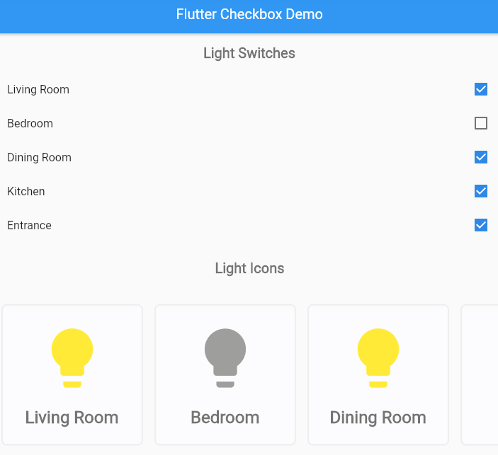
See below for a screenshot of what the final app will look like.
This demo app does not depend on any third party libraries—you can use DartPad to follow along. DartPad is a web based editor where you can try out Flutter code without the need to install anything on your computer. To follow along in this tutorial, head over to https://dartpad.dev/.
Step 1: Create the Starter App Shell
To start off, we’ll create the basic app shell. If you paste the code below into a DartPad code editor and run it, you’ll see that it displays a homepage, app bar, and text widget in the center.
import 'package:flutter/material.dart';
void main() {
  runApp(MyApp());
}
class MyApp extends StatelessWidget {
  @override
  Widget build(BuildContext context) {
    return MaterialApp(
      theme: ThemeData.light(),
      debugShowCheckedModeBanner: false,
      home: MyHomePage(title: 'Flutter Checkbox Demo'),
    );
  }
}
class MyHomePage extends StatefulWidget {
  final String title;
  MyHomePage({this.title = 'Demo'});
  @override
  _MyHomePageState createState() => _MyHomePageState();
}
class _MyHomePageState extends State<MyHomePage> {
  @override
  Widget build(BuildContext context) {
    return Scaffold(
        appBar: AppBar(
          title: Text(widget.title),
        ),
        body: Center(child: Text('Flutter Checkbox Demo')));
  }
}
Step 2: Create the Layout for the App
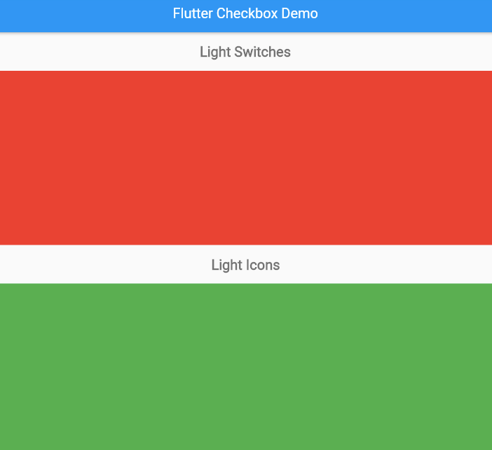
Let’s start to build the layout of our app. The app layout has two parts. First is the top part, which contains all the checkboxes for controlling the lights in each room. Second is the bottom part, which contains the visual representation of the lights in each room.
Since this main layout of our app is vertical, we’ll use a column to create it. Therefore, replace the body of our home page Scaffold with a column. The column has four children. The first is a container for the top section header that displays the header text Light Switches. The second is the area where the light switches will go. For now, we’ve inserted a placeholder container with a red background. The third child is a container for the bottom section header that displays the text Light Icons. Finally, the fourth child is the area where the visual representation of the room lights will go. For now, we have inserted a placeholder container with a green background.
import 'package:flutter/material.dart';
void main() {
  runApp(MyApp());
}
class MyApp extends StatelessWidget {
  @override
  Widget build(BuildContext context) {
    return MaterialApp(
      theme: ThemeData.light(),
      debugShowCheckedModeBanner: false,
      home: MyHomePage(title: 'Flutter Checkbox Demo'),
    );
  }
}
class MyHomePage extends StatefulWidget {
  final String title;
  MyHomePage({this.title = 'Demo'});
  @override
  _MyHomePageState createState() => _MyHomePageState();
}
class _MyHomePageState extends State<MyHomePage> {
  @override
  Widget build(BuildContext context) {
    return Scaffold(
        appBar: AppBar(
          title: Text(widget.title),
        ),
        body: Column(children: [
          Container(
            padding: EdgeInsets.all(16.0),
            child: Text(
              'Light Switches',
              style: TextStyle(
                  fontWeight: FontWeight.bold,
                  fontSize: 20.0,
                  color: Colors.black54),
            ),
          ),
          Expanded(child: Container(color: Colors.red), flex: 1),
          Container(
            padding: EdgeInsets.all(16.0),
            child: Text(
              'Light Icons',
              style: TextStyle(
                  fontWeight: FontWeight.bold,
                  fontSize: 20.0,
                  color: Colors.black54),
            ),
          ),
          Expanded(child: Container(color: Colors.green), flex: 1),
        ]));
  }
}
Below is what you can expect to see at this stage:
Step 3: Insert the Variable That Stores the On/Off State of Each Light
Now that we have the basic layout for the app, let’s shift focus to our app’s state management. For our app, the state is the list of light switches and the on/off values of those switches at any given time.
Since this is a simple app, the state can be managed all within the _MyHomePageState class. To hold the state, we’ll create a variable in the _MyHomePageState class named lightSwitches. The lightSwitches variable will be of the type Map<String, bool?>. By using this type, we can store the name of the room in String and the on/off value of that room’s light in the boolean. Insert this variable into _MyHomePageState at the top and initialize it as shown in the code snippet below. In the next steps, we’ll connect this to a checkbox.
class _MyHomePageState extends State<MyHomePage> {
  Map<String, bool?> lightSwitches = {
    'Living Room': true,
    'Bedroom': false,
    'Dining Room': true,
    'Kitchen': true,
    'Entrance': true,
  };
  @override
  Widget build(BuildContext context) {
...
Step 4: Add a Checkbox to the Light Switches Pane
We are now ready to start wiring up the checkbox UI components. We’ll go step by step, starting with a single checkbox in the top part of our layout. Eventually, we want a list of checkboxes, so we’ll use Flutter’s CheckboxListTile widget. This is a checkbox with some additional capabilities added to it for convenience when working with a list.
Replace the red container in the top section of the layout with a SingleChildScrollView widget, with vertical scroll direction, as shown in the code snippet below. We’re using a SingleChildScrollView to enable the list to scroll if there are more checkboxes than can fit on the screen.
@override
Widget build(BuildContext context) {
return Scaffold(
appBar: AppBar(
title: Text(widget.title),
),
body: Column(children: [
Container(
padding: EdgeInsets.all(16.0),
child: Text(
'Light Switches',
style: TextStyle(
fontWeight: FontWeight.bold,
fontSize: 20.0,
color: Colors.black54),
),
),
Expanded(
child: SingleChildScrollView(
scrollDirection: Axis.vertical,
child: Column(
children: [CheckboxListTile(
title: Text('Living Room'),
value: lightSwitches['Living Room'],
onChanged: (bool? value) {
setState(() {
lightSwitches['Living Room'] = value;
});
},
)],
),
),
flex: 1),
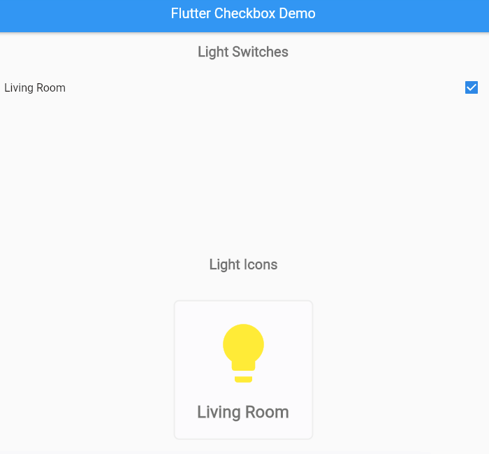
...Notice in the code snippet above that when we define the CheckboxListTile, we pull in the value of the Living Room light switch from the lightSwitches state variable we defined earlier.
Also, note that we’ve provided a callback to the onChanged property of the CheckboxListTile. The callback updates the on/off value of the Living Room light when the checkbox is tapped, and it causes the checkbox to rebuild to reflect its new state.
When you run this in DartPad, you’ll see the single CheckboxListTile, and you’ll be able to change its state by tapping on it. In the next step, we’ll wire up our state to the light bulb visualization.
Step 5: Add Icons to Visualize the State of Each Light Bulb
Now, we’ll create visualizations for the lights in our different rooms.
Creating a Widget for the Light Bulbs
For this, we first create a new stateless widget class and name it LightBulbCard. Paste the code below at the bottom of your code editor window.
class LightBulbCard extends StatelessWidget {
  const LightBulbCard({
    this.on = true,
    this.room = 'Room Name',
  });
  final bool? on;
  final String room;
  @override
  Widget build(BuildContext context) {
    return Container(
      decoration: BoxDecoration(
        border: Border.all(color: Color(0xffeeeeee), width: 2.0),
        color: Colors.white38,
        borderRadius: BorderRadius.all(Radius.circular(8.0)),
        boxShadow: [
          BoxShadow(
            color: Colors.white10,
            blurRadius: 4,
            spreadRadius: 2,
            offset: Offset(0, 2),
          ),
        ],
      ),
      margin: EdgeInsets.all(8),
      height: 200,
      width: 200,
      child: Column(
        mainAxisAlignment: MainAxisAlignment.center,
        children: [
          Center(
              child: Icon(
            Icons.lightbulb,
            size: 100.0,
            color: on! ? Colors.yellow : Colors.grey,
          )),
          SizedBox(
            height: 20.0,
          ),
          Text(
            room,
            style: TextStyle(
                fontWeight: FontWeight.bold,
                fontSize: 24.0,
                color: Colors.black54),
          ),
        ],
      ),
    );
  }
}
Adding Light Bulb Cards to Our Layout
Similar to what we did with the checkbox in the top pane, we’ll add a single LightBulbCard to the bottom pane of our layout and connect it to our lightSwitches state variable. Replace the green container with the code snippet below.
SingleChildScrollView(
                scrollDirection: Axis.horizontal,
                child: Row(
                  children: [
		LightBulbCard(on: lightSwitches['Living Room'],
		room: 'Living Room')],
                ),
              )
Notice that we are now using a horizontal scroll direction, and our child widget is a row. This is so that we can scroll horizontally through our light bulbs if there are too many to fit on the screen.
For more information on horizontal scroll views, see my earlier post Build A Flutter Horizontal ListView in 20 minutes.
When you run the code now, you’ll notice that tapping on the checkbox in the top pane causes the light icon to change from yellow to grey and vice versa, reflecting the state of the light switch.
Step 6: Create Dynamically Generated ListsViews
At this point, we have one working checkbox with a corresponding light bulb visualization. It’s now time to display all our light switches, while also making our code more flexible.
One approach to showing all the light switches would be to manually add the checkboxes and light bulb cards to match what we have in our lightSwitches state variable. This would work, but would not be very maintainable. What if we changed the name of one room, or wanted to add or remove rooms?
A better approach is to auto generate all the checkboxes and light bulbs based on the lightSwitches state variable. Update the children property of the light switches column to match the code below.
child: SingleChildScrollView(
        scrollDirection: Axis.vertical,
        child: Column(
          children: lightSwitches.keys
              .map((roomName) => CheckboxListTile(
                    title: Text(roomName),
                    value: lightSwitches[roomName],
                    onChanged: (bool? value) {
                      setState(() {
                        lightSwitches[roomName] = value;
                      });
                    },
                  ))
              .toList(),
        ),
      ),
This code takes each room name (i.e., each key in our lightSwitches map) and generates a CheckboxListTile. We use the room name to set the title for the CheckboxListTile. We also use the room name to look up the on/off state of the light bulb for that room. In the onChanged callback, we update lightSwitches with the new on/off value for that room’s light.
The result is a list of widgets that we can assign to the children property of the column.
We’ll make a similar change for the light bulb cards. Update the children property of the light bulb row to match the code below.
child: SingleChildScrollView(
        scrollDirection: Axis.horizontal,
        child: Row(
          children: lightSwitches.keys
              .map((roomName) => LightBulbCard(
                    room: roomName,
                    on: lightSwitches[roomName],
                  ))
              .toList(),
        ),
      ),
This code generates a LightBulbCard for each room in the lightSwitches state variable. Below is the how the final app looks.

Step 7: Test Your App
Congratulations! You have built the UI for a simple home automation app. Make sure the app is working as expected by testing different scenarios. Change the names of the rooms, add or remove some rooms, and make sure you can scroll through the entire list. If you got stuck at any point, you can see the end product using this link: https://dartpad.dev/71b60ed5979b8c86145e47a25298b21a
Conclusion
We’ve gone through how to create and use checkboxes in Flutter. You learned what a checkbox is, what it is used for, and how to generate one for your Flutter app. You also learned how to update the state of a checkbox when a user taps on it. To apply this knowledge, we built the user interface for a simple home automation app that enables users to control the lights in their homes by using checkboxes to turn the lights on or off.
Now that you’ve learned how to create and use checkboxes in Flutter, go ahead and get creative! You can take this demo and make it more sophisticated.
The knowledge that you gained from this tutorial will help you when building all kinds of apps.
If you want to learn more, a lot of useful content can be found on the Waldo. There, you’ll find content on mobile design, mobile engineering, QA & testing, and more.
